Friday, 25 June 2010
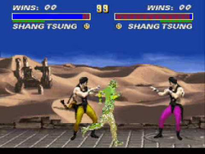
This is the mortal kombat movie me, anth and paul did for our personal project. this videos shows glitchs and how there done on mortal kombat. this was recorded using the recording program fraps. it took a while to record the movie due to the fact we couldnt find a second controller and converter. It was alot of fun making this movie with paul and anth :)
Thursday, 10 June 2010
techno chickhen
Here is my finished stop motion animation with music and credits, i made this with istop motion and clay. it was easy to make this, it took only about 15-20 to film. this movie would of been better if i didnt rush making this and took my time on it.
Thursday, 27 May 2010
today
Thursday, 20 May 2010
what i did today,
i recorded a few glitches with anth today on his laptop using the recording system FRAPS, glitchees are from general gameplay either acidental or forced upon and cause the game to mess up, ere is an example of a glitch
Thursday, 13 May 2010
3rd logo
second logo finished
Friday, 7 May 2010
finished edited logo
Thursday, 6 May 2010
Logo im gunna edit alot

this logo is going to be edited to make it look glitched for my personal project, i am going to be editing this in photoshop. i i had difficulties finding out what i was ment to be doing, i just found out was i was ment to be doing at the end of last lession, now i know what im going to be doing, i might edit a second logo
Thursday, 29 April 2010
Thursday, 22 April 2010
Thursday, 1 April 2010
Thursday, 25 March 2010
Friday, 19 March 2010
banksy part 2
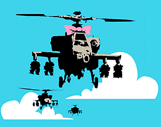
banksy communicates anti-war with his images, his medium is stencils and spray cans and my favourite image is the graffiti removal hotline
banksy who is he
Banksy started as a freehand graffiti artist 1992–1994[14] as one of Bristol's DryBreadZ Crew (DBZ), with Kato and Tes
Thursday, 18 March 2010
about freakin time 18th march

here is my finished iron man image, i like how the text is seeable over the iron man picture. overall i think it looks good. it looks good because over the greys blend in and looks like a shadow which makes the text stand out. this can be improved if it had more color to it and the text was positioned differently.
Friday, 12 March 2010
linkin park gig poster
System of a down poster
humpty dumpty
the scream
alice in wonderland
specific event
Thursday, 11 March 2010
better late than never
i started to work on my iron man image edit, i didnt get much done cos i started it late os i didnt know what to do at first
lost model 1887
had to remake 2 models for my animation because my original moddels have been stolen/lost
Thursday, 4 March 2010
Gunna make a montage.....MONTAGEEE!!!!!!111one
Week One
Thursday: Talked about how to plan for the assignment
Friday: Update checklist of work produced for assignment and how iron man can be better
Week Two
Thursday: consider different idea for images
Friday: Update checklist of work produced for assignment and work for different ideas for lyrics and images
Week Three
Thursday: work on final idea
Friday: Update checklist of work produced for assignment and continue work
Week Four
Thursday : Printing, Copying to Disk (if animation)Friday: Making sure everything is up to date and in sketchbook
Thursday, 25 February 2010
BBC quiz thing

Fast-moving - We can tell from your results that you are a speedy surfer - one of the characteristics of the Web Ostrich, whose real-world counterpart has an impressive top speed of 45mph.
Sociable - The web is a social place. You take full advantage of this when you search for information by using social networks and other sites whose content is created by its users. Real-world ostriches are also highly social, even keeping eggs in each other’s nests to share the burden.
Specialised - The real-world ostrich is a true specialist, highly adapted to survive in hot, dusty African grasslands. You might not be at risk from lions when browsing the web, but you are still very focused. From your test we can tell you do best when you concentrate on one task at time, rather than several things at once.
animation, idea 9001
i got a field as my backgrund and im going to do research for my final movie idea
Friday, 5 February 2010
The tees valley Giants, behold the fail
The Bottle Of Notes, Behold The Funkyness
The Angel Of The North, Behold The Awesomness
Thursday, 4 February 2010
Iron man is evil i tell you........EVIL!
the colour of my iron man pciture
the colours of my picture are a mixture of light and dark. there are mainly grays, silvers and yellow, the tone is dark and sinister, with a repeated image altered with a metalic look.
Friday, 29 January 2010
iron man lyric page
today in lesson
today in college i am designing my background for my iron man character, its a town with a explosion going off in the background
Thursday, 28 January 2010
this lesson
this lesson i did my sketch for my iron man character, it is a rough idea, i will be doing a better version soon
stop motion idea,
my stop motion idea is, i look to the sky , point and yell TAAANK!! and a tank falls out of the sky
My own animation idea, redone
my idea for my animation is going to be a either going to be a 30 second cinamatic or a 30 - 60 second montage
Friday, 22 January 2010
TAAAAAAANK!!!!!!! (left 4 dead reference woop)
Drawing exercise
today we did drawings by using basic shapes and with having the pencil leaving the page,
Thursday, 21 January 2010
My custom animation idea
my animation idea is a either a mini-montage or a random slideshow music video
Friday, 15 January 2010
Thursday, 14 January 2010
Friday, 8 January 2010
depth, movement and perspective part 2
This picture shows movement, colour and line. This picture would appeal to people who are interested in nature and fine art. I found this picture on a art site but i cant remember which the name due to the fact it was months ago i found this image.

This picture show colour, line and perspective. this image would appeal to people who like detailed and colorful pictures. I found this picture on la-art-tutor.com, not sure were abouts on the site.
Thursday, 7 January 2010
Modernwarfare 2 review
Modern warfare is the squel to call of duty 4, the story is set 5 years from the previous game, with an better multiplayer with new perks, new weapons, new maps and a brand new 3rd person option. there has a been a grapgical inprovement since the last game. multi-player features new perks, new killstreaks and the abilty to upgrade perks, one of the new perks is a tactical nuke which is awarded with a 25 kill streak, the nuke ends the game as a victory to the team who activated the nuke. perks are upgraded when certain require ments are met like for example the perk "last stand" gets upgrade when u get 25 kills while in last stand.
Wednesday, 6 January 2010
Subscribe to:
Comments (Atom)


